Category pages are a critical entry point for users browsing events. However, the existing design made discovery difficult due to poor visual hierarchy and limited browsing flexibility. I led the redesign to create a scalable, modular framework that improved event discovery while supporting hundreds of subcategory pages.
Role:
Product Design Lead
Platform:
Responsive Web
Duration:
Q3 2024
Problem
The existing category pages made event discovery difficult, limiting engagement and conversions. Poor visual hierarchy, restricted browsing, and lack of personalization resulted in missed opportunities for both users and the business. A redesign was crucial to improve usability and drive sales.
Insufficient Exploration & Content Depth
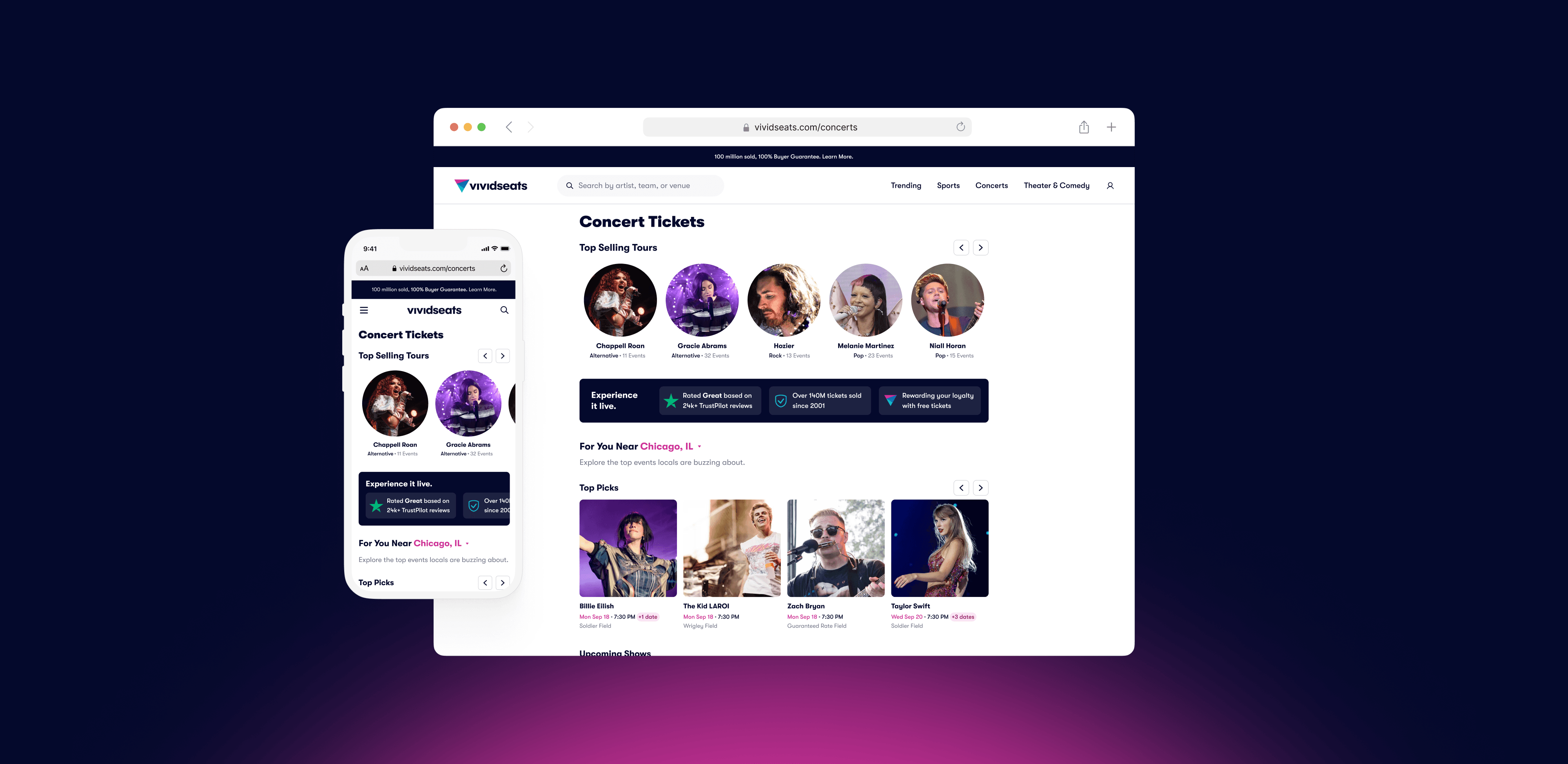
The page failed to showcase the full depth of our inventory, presenting only a static hero image and a linear list of events. Users had no intuitive way to browse by subcategory, performer, or venue, limiting their ability to discover relevant events and reducing engagement opportunities.

Rigid Sorting & Friction in Location Selection
With events automatically sorted by date and no alternative sorting options, users had little control over how they explored. The arbitrary split between "Near You" and "All Other Locations" added confusion, and the inability to easily update location created unnecessary barriers to finding the right event.

High Interaction Cost for Basic Browsing
Heatmap analysis revealed that the most-clicked element was the "Show More" button, signaling a poor information hierarchy. Users were forced into extra interactions just to access additional events, instead of being presented with a seamless, scrollable discovery experience.

Goals
Transform the category page into a powerful exploration hub that increases event discovery, improves usability, and enhances user engagement.
The redesigned page must:
Showcase the full breadth of available events, including subcategories, performers, and venues.
Empower users with flexible sorting and seamless location selection.
Streamline browsing by reducing unnecessary clicks and improving scannability.
By improving navigation, refining content hierarchy, and reducing interaction friction, the category page can drive deeper engagement and higher conversions.
Process
Research & Insights
Heatmaps and session recordings showed friction in event discovery. Competitive analysis identified best practices for filtering and navigation. Internal audits highlighted gaps in content hierarchy and search.

Design & Development
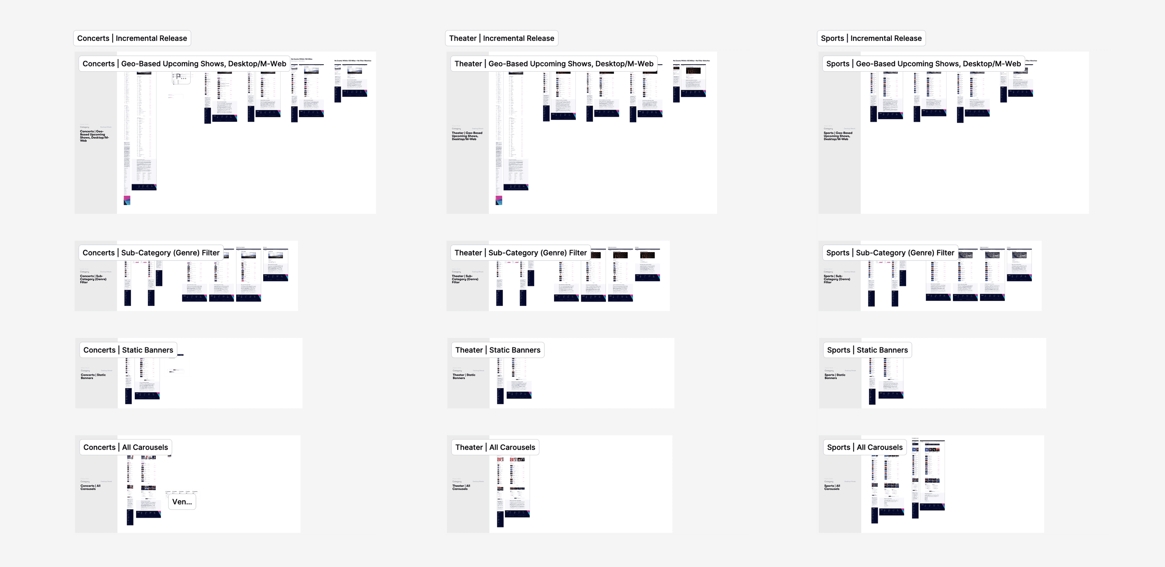
Introduced a modular layout for better browsing and discovery. Added flexible sorting, streamlined location selection, and merchandising. Built high-fidelity wireframes for testing and iteration.

Testing & Iteration
Phased rollout to measure impact and minimize risk. Ensured scalability across subcategories. Optimized based on user feedback and performance data.
Solution
With a focus on meeting users where they are—whether casually browsing or ready to purchase—the updated category pages offer more pathways for engagement and make it easier for users to find and connect with events that match their interests.


Impact
The category page redesign transformed how users explore and engage with events. At the same time, we laid the groundwork for scalable subcategory pages, ensuring a consistent, flexible structure that adapts as the platform grows. With streamlined navigation and personalized content, we boosted conversions, increased user satisfaction, and drove higher revenue, fostering greater brand loyalty along the way.

